HonorHealth
In response to a changing health care landscape, Scottsdale Healthcare and John C. Lincoln Health Network came together to form a single system. The new name, HonorHealth, goes beyond an identity. It represents a commitment to what the organization does — as well as what patients should do for themselves. By putting the patient at the center, it embodies the new brand platform: making healthy personal.
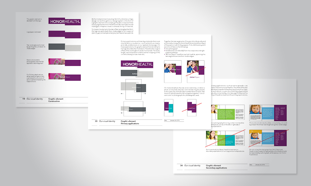
With a guiding concept rooted in duality, the design system juxtaposes portrait photography with bold graphic elements to convey the idea of two parts coming together to form a whole. The brand’s signature purple not only sets it apart in the market and conveys warmth, it draws on the shared color — and equity — of the legacy brands. HonorHealth’s naming formula echoes the sense of connection expressed visually, and is used throughout a wide range of communications.
Research showed that one year after launch, HonorHealth was already top of mind among consumers. The organization ranked:
Second in health system awareness
As the health system consumers were “most likely to use”
As consumers’ top choice for seven of nine service lines
Client: HonorHealth | Agency: Monigle | Senior Designer: Kristan Butler | Creative Director: Laurent Tschumy | Logo Designer: Renee Talbot | Strategy & Client Experience: Gunnar Jacobs & Sawyer Schweitzer


